
I love to decorate. For those of you following my blog, you may be thinking, "Well, we know you like to decorate for Halloween." And it's true, but I love to decorate my home even when there is no holiday on the horizon. For that reason, I tend to haunt the decor blogs and flip through decor mags while sipping coffee at the Barnes & Noble cafe. Another place for decor inspiration is a showhouse and one of the biggest out there is the Kips Bay Decorator Showhouse. I realize that showhouses are like runway couture in fashion. They're more about ideas and concepts rather than direct translation, but I felt like this was a combo of the good, the bad, and the ugly.
First The Good
First The Good
This gorgeous staircase was decorated by Rod Winterrowd. I think it's such a beautiful entry to the showhouse. I have a whole file of gorgeous staircase inspiration even though my current home only has a basement stair. Next home, maybe.

This Dining Room, by Cullman Kravis, is one I could draw inspiration from. I love the enormous artwork over the fireplace. The herringbone floors are a favorite of mine. I love the greek-key trim on the drapes and the large round pedestal table. I feel like the accessories are a bit over-stylized i.e. the bookcases feel contrived. Really, how many sky blue foo dogs could one person own? I say this as an asian girl who actually likes foo dogs. Still this room squarely fits into The Good category.

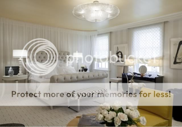
This Bedroom, by Noel Jeffrey, has a lot of nice things going on in it. It's calming without being colorless. I'm going to have to pass on the little girl underpants fabric on the windows and the UFO ceiling fixture, but I like the easily DIYed artwork and the patterned carpet. I love upholstered beds and currently have an upholstered headbord. I'd like to see a bit more of the yellow in this room maybe over on a bedside table and I'd definitely nix the matching lamps. I like asymmetry.
The Bad
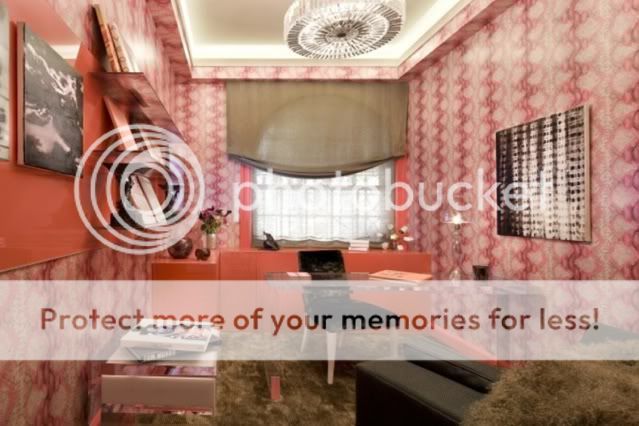
I want to start with letting you all know that I loooooove this wallpaper. So how could this room, by Elizabeth Pyne, be Bad? Because I can see my breath as I type this. Even Narnia's Snow Queen would need an extra sweater in this room. What this wallpaper needs is some wood to warm it up. And no the little tree stump pseudo coffee table is not cutting it. Why are all of the accessories a high gloss white? Even the little tree sculpture says come back in spring, there is no life here. The little girl's picture isn't exactly life, either. She looks like one of those scary, expressionless, alien kids in the movie The Village of the Damned.

The Ugly
Warning! The next image may cause retinal bleeding and night terrors. What in the world was Brett Beldock thinking? Strike that. I don't want to know. Why, why? I can't think of anything to say about the wallpaper that you aren't already saying yourself. The carpet is that extra long kind that hides army men and cookie crumbs and is the color of baby poop. And what is it doing behind the leather chair? It's eating the chair! Why hide an arched window behind a shapeless window mistreatment? Why?
You can pull your hands away from your face, now. After that trauma, I think I need some comfort food. Off to bake something. I'll try to remember to take pictures before I've gorged myself.
Thanks for popping in and listening to my madness.
OOhh I love that staircase and the blue vases in the living room just pop out! Love it! Now the tree stump in the middle of the room? What the heck is up with that??? Haha!
ReplyDelete